Election signs have been very prominent these days.
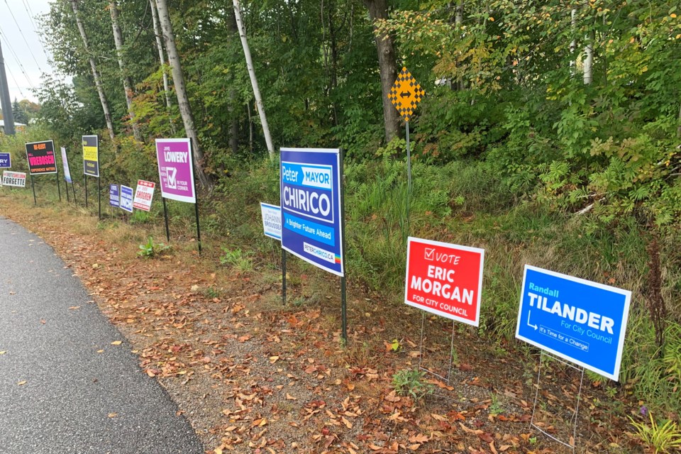
With 29 candidates running for council and three running for mayor in the city of North Bay, election signs can be found on lawns, near stop signs, and in areas where there is high traffic.
Tristan Godman, Creative Director, at Clark Marketing and Communications in North Bay knows a thing or two about marketing.
He has over 20 years of experience in the field and started out as a designer and art director. He believes there is more to the science of election sign design than just putting a name on a sign and sticking it into the ground.
"The best practices for signs are the best practices in general for design so hierarchy is always a really important thing," explained Godman.
"It is kind of obvious but making the most important stuff the biggest and the most legible and using the signage on whatever real estate you have available to do that.
"Everything is relative right so you want to make sure that relative to the other elements on the sign. You are sort of following that hierarchy of information you want to deliver."
So is it better to have big letters or big photos, or perhaps both?
"You hear a lot of advice on the best practices for a while have been making the last name really large and bold depending on how well the candidates name is known, you might also do that with their first name or depending if they are more commonly known by their first or last name or just their first name," he explained.
"For photography there may be a strategic reason to include a photo, and from a design kind of point of view, it would be the designers job to make that balance with the other elements and make sure it does not sacrifice the name or any of the other elements that are deemed to be the top priority in the sign or communication."
Then of course there is sign colour.
"I think there are a lot of strategic reasons why a candidate would use a particular colour or a politically known colour, but for design I really think at the end of the day it is about the contrast, so it is about how that colour contrasts with the other colours that are used on the signage and so it kind of comes back to everything being relative and ensuring that legibility comes through with whatever colour combinations you are using," he explained.
Of course, where you put your signs and how many signs you put up can be important factors too.
"It seems to be some best practices the more signs you can put up the better. If it can be larger you can have a bigger impact. It can be how the colours used fit in an environment," he said.
We will find out on October 25 whose signs really worked and whose didn't.


