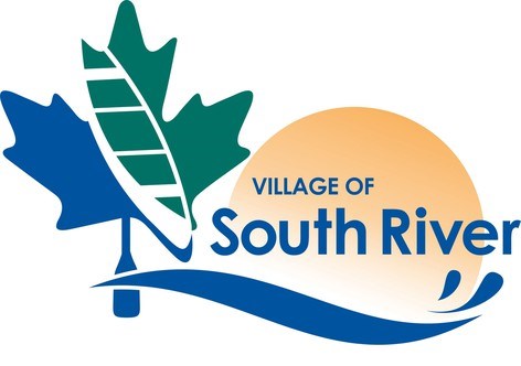
South River council has tentatively decided on the proposed look of the new logo for the municipality.
The logo features a teal and dark green maple leaf on the left side with a canoe in the middle, splitting the leaf and colours in two.
The stem of the leaf is shaped like an oar.
Joseph Segato, the business development intern, says the maple leaf was chosen to showcase South River's abundant hardwood forests, many of which include maple trees.
The phrase 'Village of South River' is superimposed over the sun and below the phrase and sun is a blue, wavy water-like streak.
Members of council said they liked the proposed look, saying it's very colourful.
In reaching a decision on the look of the final design, council rejected a colour scheme calling for the maple leaf to be teal and light green in colour.
Councillor Brenda Scott explained that when the logo is printed on material, the light green may come across as a misprint in colour.
That's because it's close in colour with the teal and could give the impression it was intended to be teal all along but something went wrong with the printing.
The dark green doesn't give the impression that it's a misprint and the viewer clearly sees it's intended to be dark green.
Also removed from the working designs was the phrase 'nature's playground,' which was written along the arc of the sun.
Segato told the council keeping the phrase might make the logo appear too busy adding “it adds more unneeded complexity to the logo.”
He further explained leaving 'nature's playground' as part of the logo could mean that wording also becomes part of the municipality’s identity.
Karen Jones Consulting of North Bay designed the new logo.
The redesign will replace the current black and white logo which is nearly 40 years old.
See: South River on hunt for new, colourful look
That logo has an image of a river log driver on one side that represents South River's early timber history and a First Nation man on the other side to represent the traditional land of the Anishinabewaki and Williams people in the Robinson Huron Treaty area.
Between the images of both men is a large square containing four smaller squares with each containing an image.
Three of the images are drawings of land and water animals of the area while the fourth depicts a sawmill blade to highlight South River's early forestry history.
This logo was created in 1982 to commemorate the Village's 75th anniversary.
In an earlier interview clerk-administrator, Don McArthur said the current logo has become dated and lacked colours.
As for colours, Karen Jones will also design a black and white version of the proposed new logo.
Coun. Brenda Scott said if the municipality ever wants to reproduce the logo on clothing, it's cheaper to go the black and white route because printing the proposed image on clothing in colour can be expensive.
McArthur said the municipality normally uses black and white on its letterhead and uses colour only in exceptional circumstances.
With council on board for the proposed look of the new logo, Segato will get that word back to Karen Jones Consulting
The consulting firm can then also get started on the black and white version.
- Rocco Frangione is a Local Journalism Initiative reporter who works out of the North Bay Nugget. The Local Journalism Initiative is funded by the Government of Canada.


